Dashboards provide a way to consume metrics and properties within vROPs and show them to the user in an easy to consume way. The dashboard may be for one object or for many and it may require user interaction to drive it or not.
vROPs comes with a variety of OOTB dashboards designed to give the user a starting point. They show useful information but they are designed for all customers so inevitably they don’t fit everybody’s use cases.
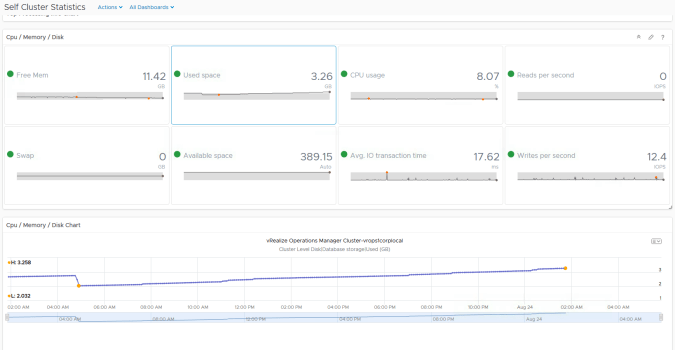
A good example are the dashboards that can be used for looking at how well vROPs is performing. Here you can see the metrics of a the vROPs cluster and the storage growth for the database.
Custom Dashboards allow you to build your own dashboards based on the information that you want to see. They can be based on an existing dashboard or be built completely from scratch and be as complicated or as simple as you want.
Where to Start
The first place I always start is deciding on what your dashboard is for. You have to have a need for a dashboard otherwise there is no point in creating one! Lets use an example use case to help explain things. Our use case is as follows:
An application administrator has a large scale application deployed to a dedicated vSphere cluster and he/she needs to be able to see how well the virtual machines on the vSphere cluster are performing. The user does not care about any of the other virtual machines in the virtual estate and does not need to see their information.
Before we start building our dashboard for this use case it’s important to understand what metrics you can use and how they can be displayed. A good way of doing this is to find one of the objects you are interested in (in this case a virtual machine) and see what metrics can be used. You may already have an idea but you can validate this by looking at the object.
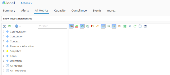
Lets go to the Environment section and use the filter search to locate a known machine (you could also browse through the object tree to find a relevant object).

By selecting “All Metrics” we can gain access to all of the metrics and properties that vROPs is collecting on the object (in this case a virtual machine).
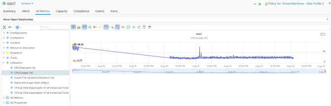
Using the tree in the left hand pane you can open up various metrics and properties and display the information as vROPs sees it in the right hand pane. Here I have selected CPU Usage as an example.
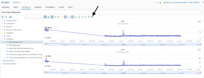
The more metrics you select the more are added to the right hand pane. If you want to build a dashboard for just one virtual machine you might get to the point where you have everything you want for your dashboard being displayed in the right hand pane. If this is the case then you can create a custom dashboard direct from this view using the “Generate Dashboard” button on the right hand pane toolbar.
Our use case is for a group of virtual machines though so we won’t generate our dashboard from here.
Creating a Dashboard
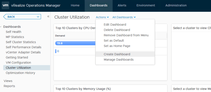
To start a custom dashboard creation from scratch for our use case we go to the dashboards section and select “Create Dashboard”.
The first stage is to give our dashboard a name and description. If we want to make this the default dashboard of vROPs then this can also be set at this point.

Our widget list is where we choose what type of information we want on the dashboard and how it will be presented. Layout is also set at this point as we drag each required widget onto the right hand pane.

As this dashboard will be dealing with more than one virtual machine it might be a good idea for the user to be able to select the particular VM they want to see metrics from. So lets start with an object list as our first widget. This will present the user with a list of VMs to choose from. To start the widget configuration we just drag and drop.

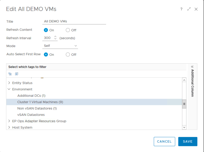
The object list widget is showing every object that exists within vROPs currently as we haven’t told it what to display so lets do that next by using the pencil edit icon when hovering over the list. This enters the widget editing screen.

The first part of the edit screen controls the behavior of the widget and where the data in the widget will come from. The self mode means that the widget will display the objects that the widget is configured for (parent and child settings mean that if the objects we will define shortly have parent or child objects then those would be displayed instead). As we want to display the virtual machines and not their parent (i.e. a host) or a child (i.e. a datastore) then we can leave the setting as “self”.
The next part is to tell the widget where to get the objects from to display. In one of my previous posts we defined a custom group which contained all the VMs in our DEMO cluster (see https://vnuggets.com/2018/08/23/vrealize-operations-6-7-custom-groups/). This is exactly what we need so we will use this to populate our object list. We classed the group as an “Environment” so this is where we find the group in the tags tree.
Once we save the widget our dashboard now is displaying our clusters virtual machine objects.

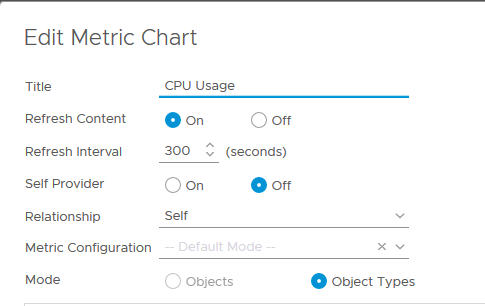
Now we have our list of virtual machines we want to be able to show more information when a user selects each one. To do this we are going to drive a second widget from our object list. Going back to our use case we want to show the performance of virtual machines and one of the ways we can do this is by using a metric chart.
With our metric chart on the screen we can edit it in the same way as we did our object list. This time we are going to be taking an object as an input so this widget is NOT going to be a self provider so this field is set to “Off”. We also want the data shown to be for the VM object and not about either its parent or its child objects so the relationship field remains as “Self”. If we have a template of metrics to use then we could select in the “Metric Configuration” list. For this example we are not going to use a template so this can be left at default.
To configure the metrics that will be displayed we first need to locate the object type that we are feeding to this widget. This is a “Virtual Machine” object so we can search for virtual machine in the filter.

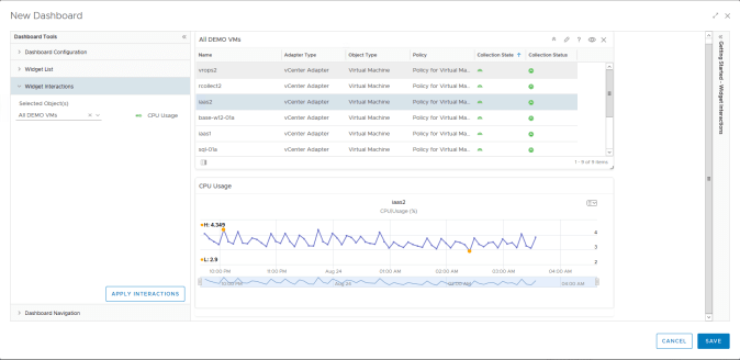
The metrics that are available for a virtual machine object are displayed in the right hand pane. We are interested in CPU Usage which can be found under the “Utilization” tree. The metric is added by double clicking on it. Our widget now looks like this:

We could add more metrics to this widget if we want and have multiple graphs being displayed but for simplicity we will stick with just this one.
Our final step is to build the relationship between our two widgets on our dashboard. At the moment our metric widget is configured to take an input from another widget but it is not configured with a specific relationship. To do this we use the “Widget Interactions” part of the dashboard creation to select which widget will be feeding our CPU usage widget. This is done by a simple drop down list selection.

Once the interaction is applied we can start selecting objects in the list to test if the graph is displaying as required.
If everything is working as expected then we can save the dashboard (we will cover dashboard navigations in a future post).
Our new dashboard is now available for use. This is obviously a simple example but it shows the basics of how a custom dashboard can be built.

